Conseris is a comprehensive data collection and analysis tool targeted to researchers and data gatherers. Its aim is to bring the power of the cloud and digital collaboration to the research community, particularly in the realms of field data collection, sharing, presentation, and analysis.
Field researchers are constantly generating data in numerous locations, but without having a desktop or laptop readily available, that data is not easily recorded. Most organizations revert to the flexibility of pen and paper to collect structured data, at the expense of slow data entry, a required second step to digitize the data, and the added waste of paper.
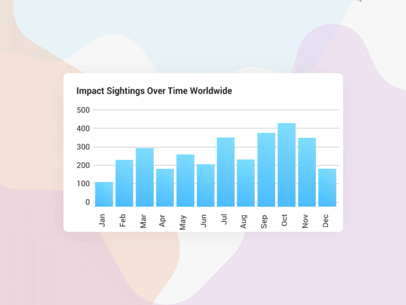
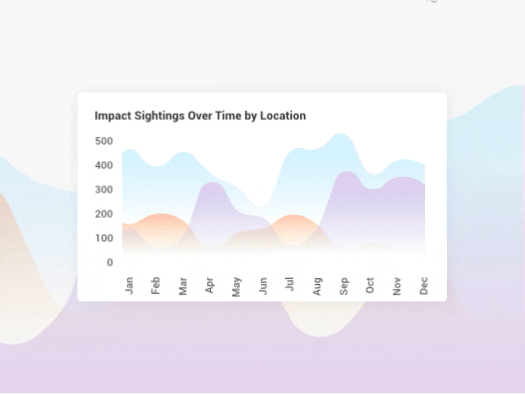
Additionally, most modern researchers and data collectors lack an effective tool to visualize their data in order to understand the patterns within it. To combat this problem, some university-based data shops have devoted their time, research, and resources to developing complex, high-level software for data visualization. These programs tend to be time-consuming and difficult to use.
Our software designers and developers knew that there was a better way. The Kuvio Creative team set to work on Conseris, a one-stop-shop for data collection, analysis, and sharing. Gone are the days of endless spreadsheets: Conseris consolidates your data and tracks your project’s evolution with a seamlessly designed archival system. With just a few simple inputs, Conseris automatically develops visualization options that simplify the once-tedious process of manually locating patterns hidden in datasets large and small.
Effortless algorithms, crisp charts, and smooth form options wrapped up in a beautifully slick user interface: What could be better?
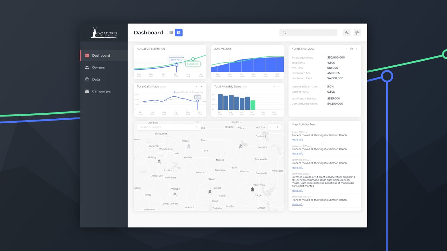
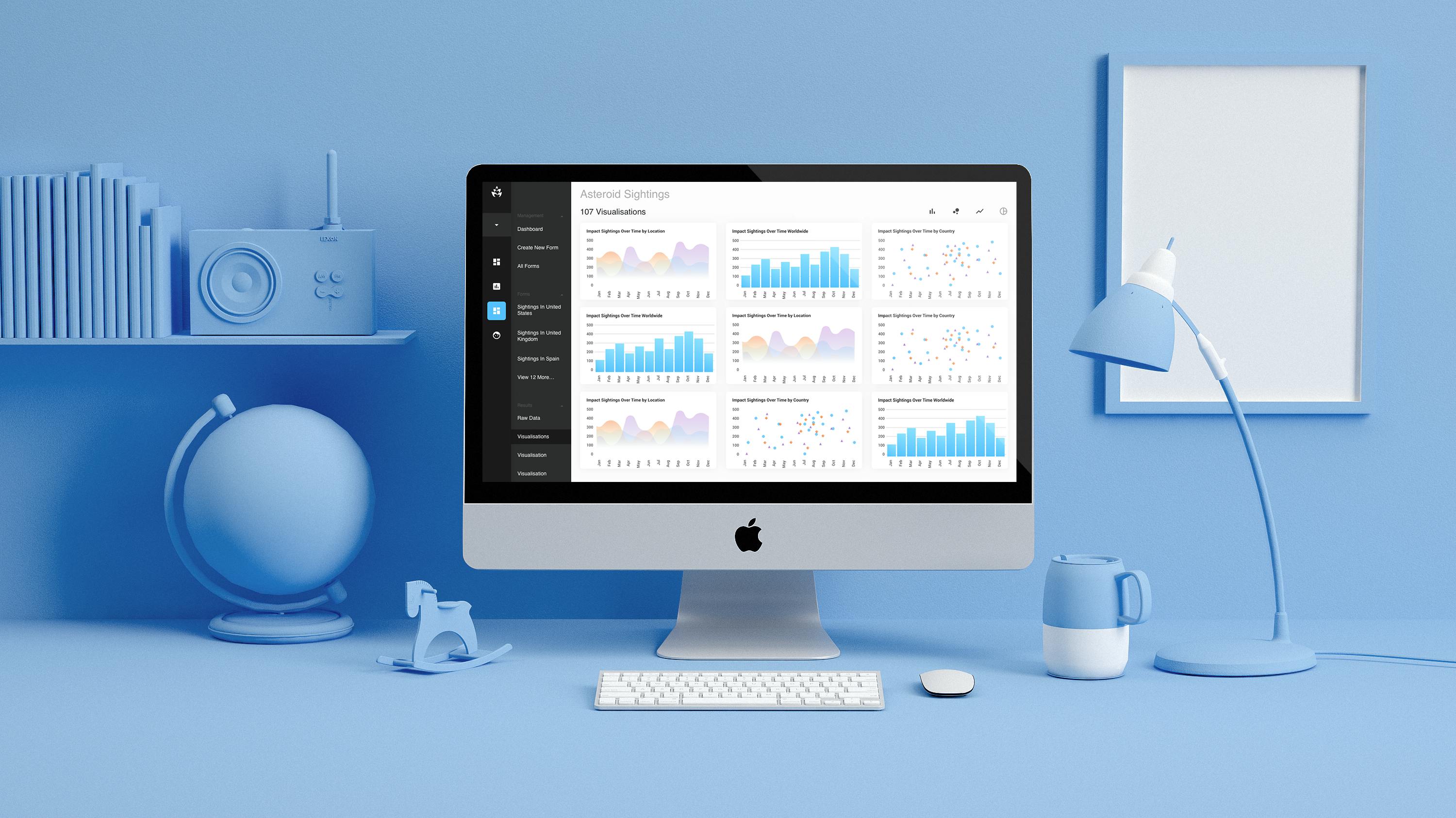
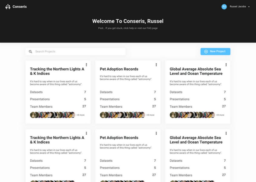
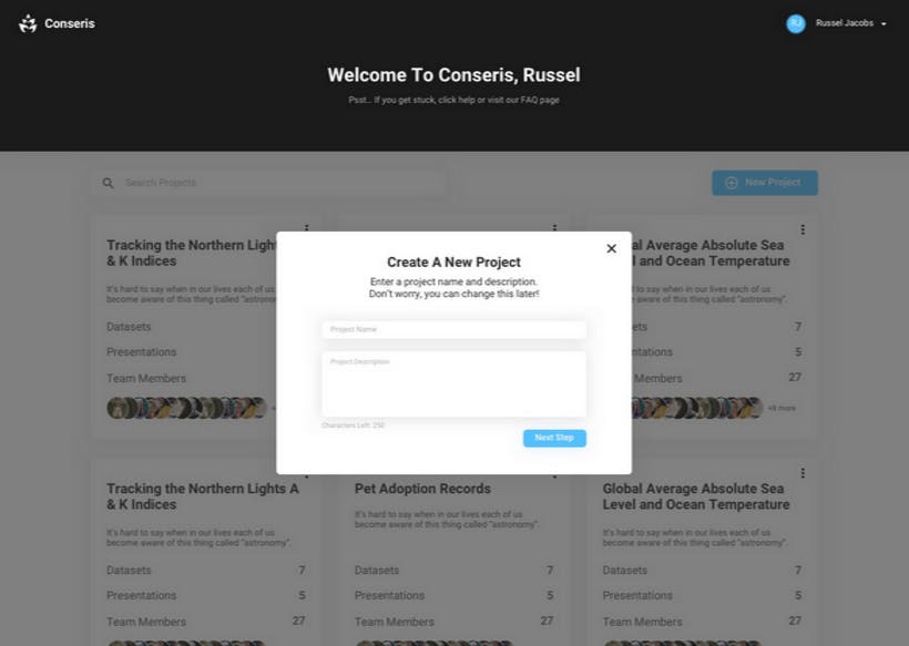
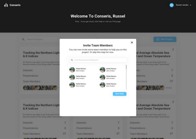
Conseris is a complex system, but it is important that the UI and navigation remain simple. To achieve this, our designers decided to use a multi-layered sidebar system. The first layer allows users to easily manage the “top level” of their application. This includes their various teams, datasets, and presentational documents. From here, each of these tabs shows different options the user can take.
For example, one main tab is “datasets” which allows users to manage each of their projects. Clicking a specific dataset will take the user to the next “tier” of the sidebar, which would be the options for that specific dataset.
This two-tier sidebar means that the information you need for where you are within the app changes as you go from section to section, allowing for an easy, streamlined experience.
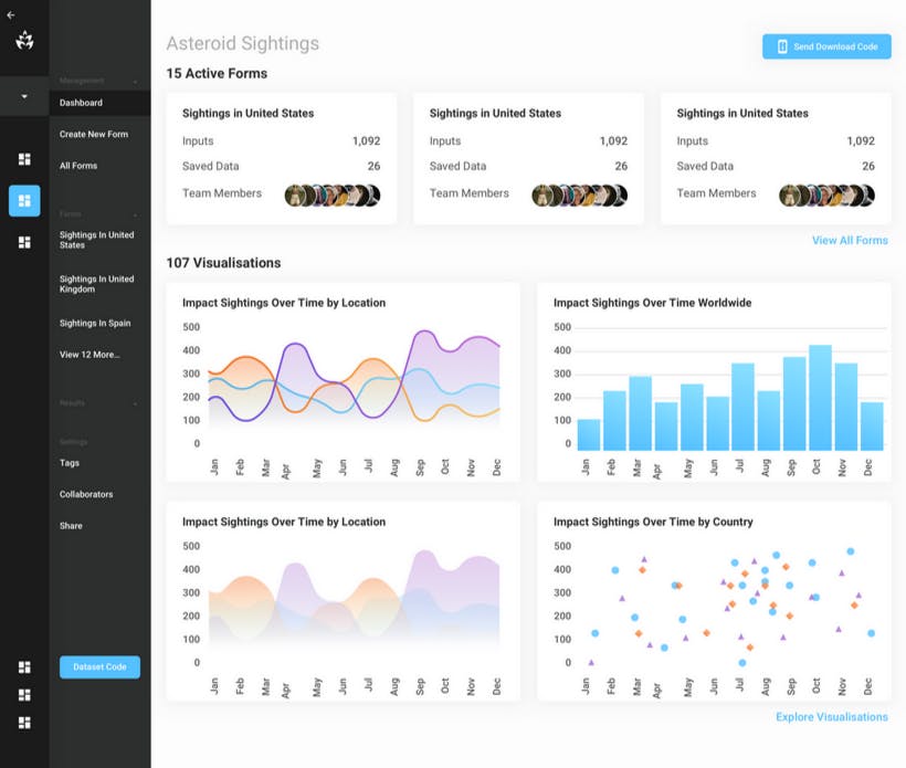
To help keep the layout of the app as clean as possible, our designers opted to use a “floating card” style for all “elements” within the app. The use of shadows eliminates harsh borders or distracting colors and allows for a “light” feeling. Functionally, this also allows the development team to stick to a card based system, with a set rules for spacing between cards. This also informs how a layout should change depending upon the size and orientation of the screen.
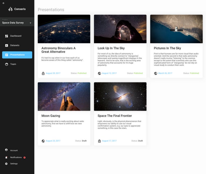

The colours of the app are limited and feature primarily black and white which keeps the design clutter-free. The use of color is restricted to “Actions” and data visuals, which helps to create a simple experience for users by drawing the eye to these features.

To promote a positive user experience, we simplify the visual hierarchies wherever possible. For example, the dark sidebar instantly draws users eyes. The options within the sidebar are highlighted so it is easy to see what the next steps are. After this, thanks to our card-based system, you know that each card is its own entity and its contents act within that card. Each set of cards can be sorted into groups. Within each card, there is a title, in the largest font, followed by smaller fonts that show data that is then connected to “labels” in a grey font. This change in size and color draws your eyes from the largest and darkest text, to the smallest and lightest.
Conseris increases researchers efficiency by integrating features that allow custom form creation, data collection without internet, analysis aided by intelligent algorithms, and easy sharing.
Users
Datasets Made
We believe in empowering you to be the best you can be, and we believe that the power of tech, design, and strong marketing can get you there. So let's get to work on your solution.